




Turn Figma Into a Responsive Next.js Page
Audit the Figma Design Before Coding

Start by treating the Figma file as a specification, not a screenshot to trace pixel by pixel. Record the available frames, page width, content max-width, spacing scale, typography, colors, border radius, shadows, and interactive states. For example, a landing page may show a 1440-pixel desktop frame and a 390-pixel mobile frame; compare what changes between them instead of copying only the larger layout. Note whether the navigation collapses, whether a two-column hero becomes one column, and which images are cropped differently.
Create a short implementation inventory before opening your editor. Mark each element as content, reusable UI, or page-specific composition: a header and button may become components, while a one-off illustration can remain local to the page. Also list missing states such as focus, hover, error, loading, and long text, because Figma often shows only the polished default. This inventory keeps the Next.js work grounded in decisions you can verify later.
Extract Figma Layout Tokens and Assets
Turn repeated Figma values into a small design token layer instead of scattering numbers throughout the stylesheet. A practical starting point might include spacing values such as 8, 16, 24, and 48 pixels, a 1200-pixel content maximum, two or three type sizes, and named surface and text colors. The exact values should come from the design, but naming them makes later adjustments consistent. CSS custom properties or a shared theme file work well for this layer.
Export assets in the format that matches their purpose. Use SVG for simple logos and icons, WebP or AVIF for photographic content when the project supports them, and preserve transparent padding only when it is part of the visual design. Give files meaningful names such as dashboard-hero.webp rather than export-17.png, then decide which images need responsive variants, fixed aspect ratios, or decorative treatment.
Build the Next.js Page Structure

Create the page from semantic regions that match the design hierarchy. A typical Next.js route may contain a header, navigation, hero, feature section, testimonial area, and footer, with each region represented by a focused component. Use the app directory conventions already established in the project, and keep page-specific composition in the route while shared controls live in a reusable components folder. Semantic elements such as header, main, section, nav, and footer improve structure before any styling is added.
Choose component boundaries around repeated behavior rather than every visible rectangle. A button with several visual states deserves one component with variants, while a single decorative line usually does not need its own abstraction. Keep content in arrays or configuration objects when the same card pattern appears four times, because this reduces markup drift and makes changes easier to review. Add client-side behavior only where interaction requires it, such as a mobile menu or carousel.
Translate Figma Layout into Responsive CSS
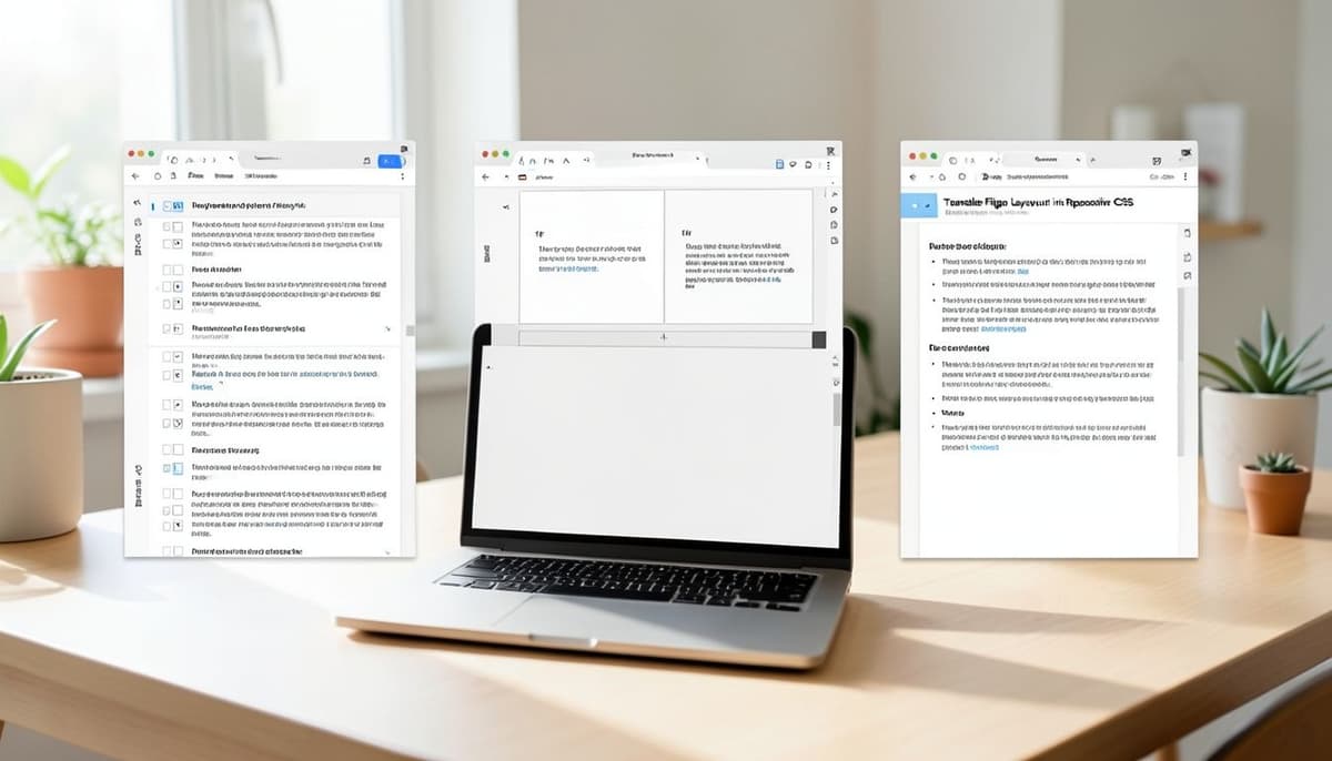
Start with the narrowest useful layout and add rules for wider screens as the design demands. Use Flexbox for aligned rows and columns, CSS Grid for structured areas, and a centered container with a maximum width for readable content. For example, a hero can use a single column below 768 pixels and switch to a 1fr 1fr grid above that point, while the gap can grow from 24 to 64 pixels. This expresses the design relationship instead of locking every item to desktop coordinates.
Avoid fixed heights for sections that contain variable text or translated content. Let cards stretch naturally, set minimum dimensions only when a visual element requires them, and use aspect-ratio for media that must maintain a stable shape. Check whether padding belongs to the full section or only to the inner container; confusing these two levels often creates the right desktop spacing and a cramped mobile result. Use media queries for structural changes, not a long chain of one-off pixel corrections.
Handle Responsive Images and Typography
Use Next.js image handling for content that affects the page layout. Give each important image a stable width, height, or aspect ratio, and choose object-fit and object-position based on the intended crop in Figma. A 16:9 hero image may need a shorter crop on mobile, so test the focal point at both 390 and 1440 pixels rather than assuming the desktop crop will remain useful. Decorative images should not push primary content below the fold or obscure controls.
Load the intended font files deliberately and define the weights that the design actually uses. Compare line height, letter spacing, and maximum line length because a heading wrapping one line earlier can move every element below it. Test longer product names, large browser text settings, and a paragraph with several lines before declaring the typography complete. Responsive sizing should remain controlled and readable, with clear minimum and maximum values instead of unpredictable scaling.
Test Next.js at Real Breakpoints

Check the page at more than the two viewport sizes supplied in the Figma file. Useful checkpoints include 320, 375, 390, 768, 1024, and 1440 pixels, plus an in-between width such as 820 pixels where hidden layout assumptions often appear. Look for horizontal scrolling, clipped buttons, navigation collisions, uneven card heights, and images that lose their focal subject. Browser developer tools make this first pass fast, but a physical phone is valuable for touch targets and viewport behavior.
Compare the implementation with Figma using the same content and the same zoom context. An overlay or side-by-side review can reveal a 4-pixel container shift, an incorrect font weight, or a section that starts too early. Record each mismatch as a small issue with a likely cause, such as container padding, line height, or image object positioning. Fix the underlying rule before adding a local override, then repeat the comparison at another width to make sure the correction generalizes.
Run Visual QA and Accessibility Checks

Treat accessibility as part of matching the design rather than a final compliance task. Verify heading order, landmark elements, meaningful alternative text, keyboard focus visibility, color contrast, and button labels that still make sense without nearby context. Test the mobile menu with a keyboard and screen reader, and make sure opening it does not leave focus trapped behind the overlay. A visually accurate page can still fail users if controls are too small or states are invisible.
Before shipping, review the page in a production-like build and inspect the browser console for warnings. Confirm that images do not cause layout shifts, links have working destinations, loading states are intentional, and the page remains usable with slower network conditions. Keep the final Figma comparison, responsive checks, and accessibility findings in the pull request so future edits have a concrete reference. This workflow turns a one-time design handoff into a repeatable quality check for every responsive Next.js page.
Related Articles
Further Reading
Tags :
- Web Development