




Advanced UI/UX Systems and Wireframing Guide
Start With Product Requirements
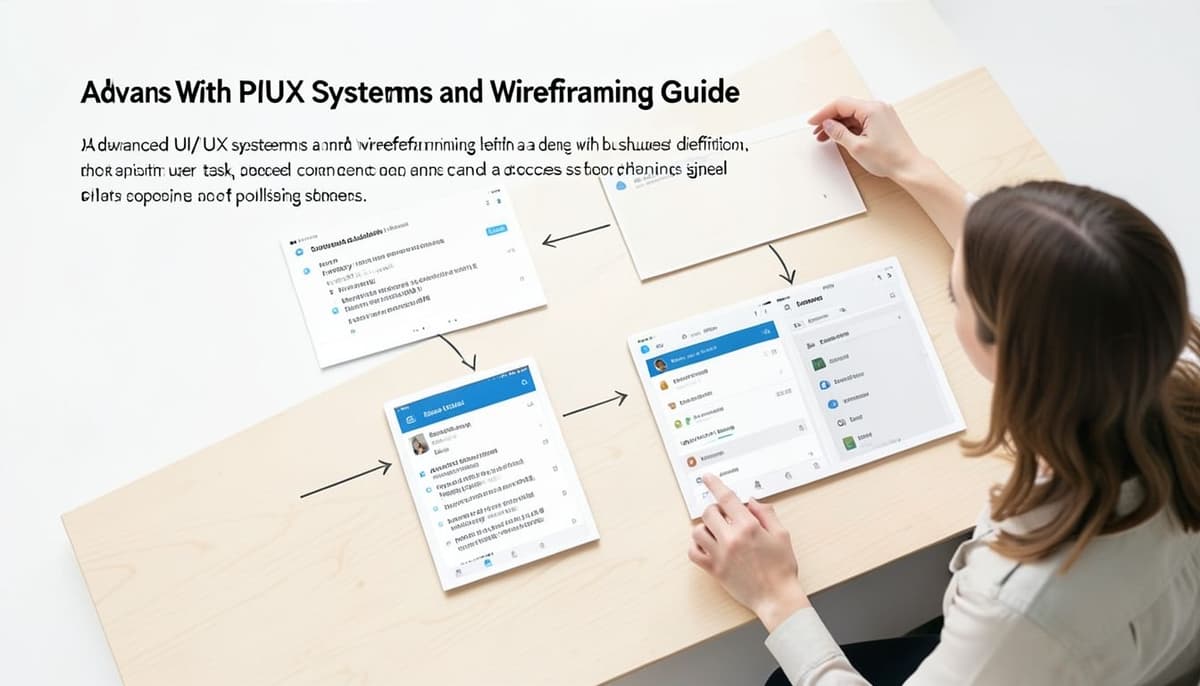
Advanced UI/UX systems and wireframing begin with a shared problem definition, not a collection of polished screens. Write the primary user, task, business constraint, and success signal in plain language before opening a design tool. For a subscription dashboard, the task might be finding the next invoice and downloading it, while the constraint is that billing data comes from an existing API. This framing keeps the system focused on decisions users must make rather than decorative patterns.
Turn the brief into a screen and content inventory before drawing layouts. For a billing flow, the inventory may include an invoice list, invoice detail screen, download action, and confirmation state. Record which data is required, which action is primary, and what happens when the data is missing or the request fails. This small specification exposes gaps early and prevents the wireframe from becoming a disconnected set of attractive screens.
Map User Flows and Information Architecture
Map the task as a sequence of user decisions, including entry points, successful outcomes, interruptions, and recovery paths. Start with the first meaningful action, such as selecting Forgot password, and continue through email submission, verification, new password creation, and confirmation. For a six-digit verification code, include incorrect, expired, and resend states rather than mapping only the ideal path. Mark decision points clearly so later wireframes represent the real workflow instead of an incomplete happy path.
Translate the validated flow into information architecture by grouping related content and actions. An analytics dashboard might place date range, account filter, chart, table, and export action in a hierarchy that supports both scanning and detail work. Keep navigation labels aligned with the language users encounter in the product, and place related tasks together instead of grouping screens by internal team ownership. When a flow requires repeated backtracking, simplify the hierarchy before adding more interface elements.
Build Wireframes by Fidelity
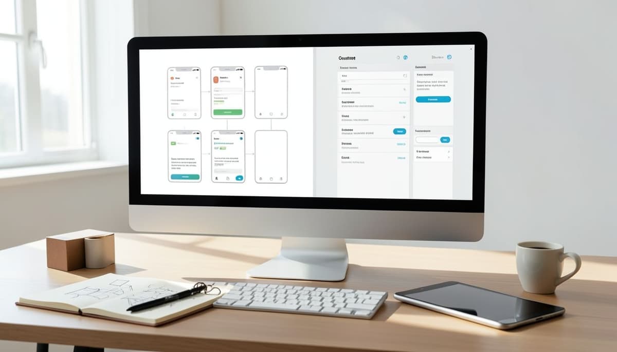
Use low-fidelity wireframes to test structure, priority, and flow before spending time on visual styling. At this stage, rectangles, placeholder text blocks, and simple controls are enough to test whether a user can locate the next action. For a mobile booking flow, sketch destination search, date selection, guest count, results, and booking review as five connected frames. Do not tune colors or shadows while the order of those screens is still uncertain, because visual polish can hide a weak interaction model.
Move to mid-fidelity wireframes when the main path is stable and content length begins to affect layout. Add realistic labels, field sizes, table columns, and button hierarchy so reviewers can identify friction in the actual composition. A checkout wireframe should show how an address error, unavailable payment method, and long delivery note affect the page rather than representing only empty fields. High-fidelity UI should come later, after each transition and important exception has been reviewed.
Create a Scalable UI System

A UI system needs shared rules for visual decisions as well as reusable components for repeated actions. Define tokens for color, typography, spacing, border radius, elevation, and motion so a change can be applied consistently across screens. A practical starting point might use an 8-pixel spacing base, a 16-pixel body size, and separate color roles for surface, text, border, success, warning, and error. Name each token by its purpose, such as surface-primary or text-muted, so product decisions remain understandable when the visual values change.
Build components around behavior and context, not only their appearance. A button needs visible, hover, focus, disabled, loading, and destructive variants when the product supports those situations. A form field should define its label, help text, error message, validation timing, and long-content behavior as part of the component contract. Keep variants limited to real use cases, because a component with dozens of nearly identical options becomes harder to maintain than several focused components.
Design Responsive and Accessible States
Responsive wireframing should show how content changes at each meaningful width instead of simply shrinking a desktop layout. Compare a 1440-pixel desktop frame, a 768-pixel tablet frame, and a 375-pixel phone frame to identify changes in columns, navigation, spacing, and content priority. A data table may retain all columns on desktop, become horizontally scrollable on tablet, and switch to stacked records on mobile. Document the rule behind each change so developers can implement behavior rather than guess from isolated screenshots.
States are part of the interface system, especially for users who rely on keyboard navigation or assistive technology. An upload component should account for idle, selecting, uploading, completed, failed, and retry states, with clear focus treatment and an accessible error message. Check that meaning is not communicated by color alone, and confirm that controls remain usable when text wraps or browser zoom increases. Annotate these behaviors directly beside the relevant wireframe or component specification so they survive handoff.
Validate Before High-Fidelity Polish

Validation should answer specific questions about behavior, not ask whether the interface looks attractive. Give a participant a task such as finding an invoice, changing its date range, and exporting the result, then observe where they hesitate, backtrack, or choose an unexpected control. Record whether the task is completed, which errors occur, and what users expect to happen next. In a booking flow, this may reveal that people search for delivery dates before selecting a product, requiring a change to the flow rather than a cosmetic adjustment.
Review findings against the original task and prioritize problems that block completion or create costly errors. If two sessions reveal that users miss the same primary action, test a stronger hierarchy or different placement before changing typography details. Run another short review after updating the wireframe and compare the same task steps, keeping the evaluation consistent. Record the reason for each design choice so future contributors can distinguish validated behavior from personal preference.
Document and Govern the System

An advanced system becomes useful when another designer can understand it without reconstructing decisions from finished screens. Each component page should explain its purpose, anatomy, supported variants, content limits, interaction states, and responsive behavior. Include examples for common contexts such as a form, a table row, and a modal instead of showing only an isolated component. For a data table, specify minimum column behavior, empty results, loading rows, and long-value handling so the pattern remains actionable.
Governance keeps the system reliable after the first release. Set a review path for new components, define who owns shared patterns, and record changes when a token or interaction rule is updated. During implementation, compare production screens with the approved system and fix one-off styles that create unnecessary variants. Audit important flows such as sign-up, search, and payment at regular release points to catch drift between the wireframes, component library, and shipped interface.
Further Reading
Build the Complete System
Continue learning with the related course:
Tags :
- Design