




UI Design Tips for Better Marketing Pages
Start With the User Goal

Effective UI design begins with a specific user goal, not a collection of attractive colors and components. For a marketing landing page, the goal might be to download a guide, book a consultation, or start a free trial. Write one primary action before opening a design tool, then make every major section support that action. If a page tries to sell a course, collect newsletter subscriptions, and promote five unrelated services at the same time, visitors may struggle to understand what to do next.
Create a simple user scenario before designing the interface. For example, imagine a visitor arriving from a search result for beginner Python classes on a mobile phone. They need to understand the course outcome, see the schedule or price, and find the registration button without excessive scrolling. This scenario gives you practical priorities for the page structure and prevents decorative elements from taking attention away from the conversion goal.
Build a Clear Visual Hierarchy

Visual hierarchy tells users what to notice first, second, and third. Use size, spacing, contrast, position, and weight to distinguish the headline, supporting explanation, proof points, and call to action. A useful marketing page might place a 42-pixel desktop headline above a 18-pixel explanation, followed by a clearly separated button. The exact values can change, but the relationship between elements should remain obvious.
Limit the number of competing focal points in each viewport. If the headline, navigation, promotional banner, testimonial, and three buttons all use strong colors, none of them feels primary. A practical first screen could contain one headline, one short paragraph, one primary button, and one supporting product image. On smaller screens, check whether the headline wraps into four or five lines; shortening the copy is usually better than reducing the font until it becomes difficult to read.
Choose Colors With Purpose

A small, intentional color palette makes an interface easier to scan and maintain. Start with a neutral background, a readable text color, one primary brand color, and an optional warning or success color. For instance, a marketing site might use white, charcoal, deep green for primary actions, and amber only for limited-time notices. Reserving the strongest accent for interactive elements helps users recognize buttons and links consistently.
Check contrast instead of judging colors only by appearance on your own screen. Light gray text may look elegant in a design file but become difficult to read on a bright phone outdoors. Test normal body text, button labels, form errors, and disabled states separately because each combination can behave differently. Avoid using color as the only signal; pair a red form border with an error message and an icon or clear wording so users who cannot distinguish red and green receive the same information.
Design Consistent Components

Reusable components create consistency across marketing pages and reduce the time needed for future updates. Define shared styles for buttons, headings, inputs, cards, navigation, and spacing before building dozens of screens. A button should not have a 12-pixel radius on one page and a sharp rectangular shape on another unless the difference has a clear purpose. Consistency lets visitors focus on the offer instead of interpreting a new interface in every section.
Use component states, not just the ideal appearance. A registration form needs default, focused, completed, invalid, disabled, and loading states. A primary button may change from “Start learning” to a loading indicator while a request is processed, but its position should not jump and cause accidental clicks. Naming tokens such as space-1, space-2, and color-primary also makes handoff easier when a developer implements the design in CSS or a front-end framework.
Make the Layout Responsive
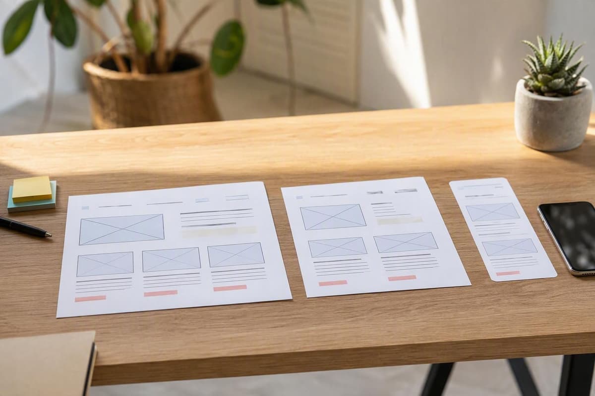
Responsive UI design adapts structure, spacing, and interaction to the available space rather than simply shrinking the desktop page. A three-column feature section may work at 1,200 pixels wide, become two columns around tablet width, and stack vertically on a 390-pixel phone. Decide which content must remain visible, which can move below the fold, and which navigation items can fit behind a menu. These decisions should be made before the layout breaks, not after testing reveals overlapping elements.
Test realistic content in at least three viewport sizes, such as 1440, 768, and 390 pixels wide. Use long course names, two-line button labels, translated text, and form error messages because short placeholder content hides layout problems. Keep touch targets comfortably sized and separated; a tiny close icon placed next to a menu item can create avoidable taps. Responsive behavior should preserve the user’s task even when the visual arrangement changes substantially.
Improve Forms and Calls to Action

Forms are often the final step between marketing interest and a lead or purchase, so every field should justify its presence. If a webinar only needs an email address and first name, asking for phone number, company size, job title, and a full address may reduce completion. Place labels above fields, provide examples when formatting matters, and state whether a field is optional. A button labeled “Submit” gives little context; “Reserve my seat” or “Get the syllabus” describes the result more clearly.
Give users immediate, specific feedback when something goes wrong. Instead of saying “Invalid input,” explain that the email needs a format such as name@example.com and keep the entered value intact. For a checkout or application form, show progress such as “Step 2 of 3” so users understand how much work remains. After submission, confirm what happened, explain the next step, and avoid displaying a vague success message that leaves the visitor wondering whether the request was received.
Test Usability and Conversion

A polished interface can still fail if users cannot complete the intended task. Run a small usability test with a specific prompt, such as “Find the evening JavaScript class and register for a trial lesson.” Observe where participants hesitate, misread labels, or use an unexpected control. Five-minute sessions with a few representative users can reveal issues such as an invisible pricing link or a call to action that sounds like navigation rather than registration.
Use analytics and controlled experiments to validate larger decisions after fixing obvious usability problems. Track events such as landing-page views, CTA clicks, form starts, form errors, and completed submissions instead of looking only at total traffic. Test one meaningful change at a time, such as a shorter form versus a longer form, and define the success metric before launching. A higher click rate is not automatically better if the new design produces fewer qualified leads or more abandoned registrations.
Related Articles
Further Reading
Tags :
- Marketing