



From Campaign Strategy to Visual Direction
A visual-concept agent should not begin with an image prompt. It should begin with the campaign decision the image must support. Give the agent the audience, offer, customer tension, desired response, channel, brand constraints, and approved copy. For example, a campaign for noise-canceling headphones may target remote workers who struggle to focus, promise a calmer workday, and use the headline Own Your Attention. That strategic foundation is more useful than asking for a futuristic product image.
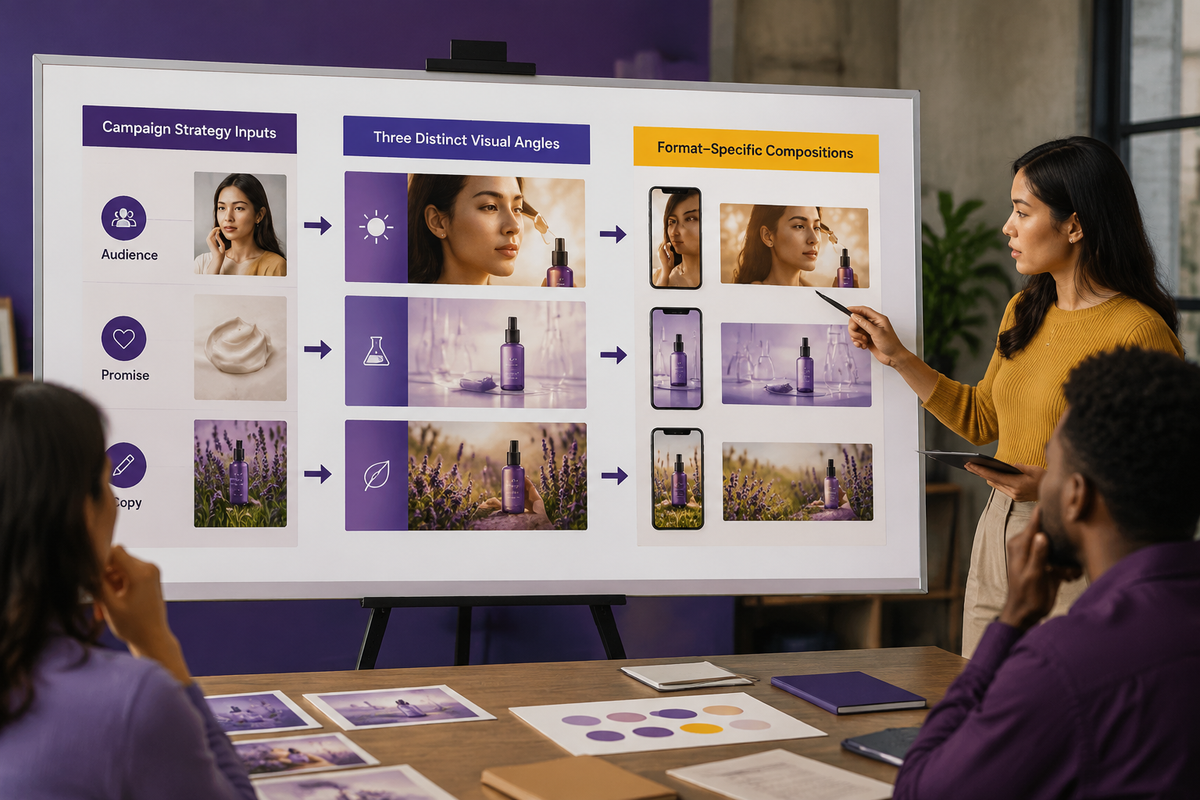
The agent’s first job is to identify the role of the visual. It might demonstrate the benefit, dramatize the problem, create an emotional world, show a product ritual, or provide visual evidence. Ask for several distinct visual angles rather than minor variations of one idea. For the headphone campaign, useful angles could include a chaotic room becoming visually muted, a calm personal zone inside a busy café, or a close-up ritual of putting on the headphones before deep work. Each angle expresses the same strategy through a different visual mechanism.
Build a Precise Creative Brief
A strong instruction separates fixed requirements from creative freedom. Fixed requirements may include the product model, logo clear space, brand colors, audience representation, legal restrictions, aspect ratio, and text-safe area. Creative freedom may include setting, camera position, lighting, props, visual metaphor, and degree of realism. This separation prevents the agent from changing essential brand facts while still allowing it to explore.
Include the placement context because an image that works on a landing-page hero may fail in a mobile feed. A vertical social ad needs an immediate focal point, simple depth, and enough negative space for copy. A wide web banner may use a subject on one side and reserve the other side for a headline and call to action. A marketplace image usually needs clearer product visibility and less atmospheric storytelling. Direct the agent to propose compositions for the actual format, not a generic square image that will later be cropped.
Give the agent a hierarchy of attention. State what viewers should notice first, second, and third. In a skincare ad, the sequence might be luminous skin first, the serum bottle second, and a scientific texture cue third. This hierarchy should control scale, contrast, sharpness, placement, and lighting. Without it, generated scenes often contain attractive details that compete equally and make the ad difficult to scan.
Generate Concepts That Complement the Copy
The visual and headline should divide the communication task. If both say exactly the same thing, the ad wastes one of its two strongest assets. A headline reading Block Out Distractions does not need an image of a person beside large written words about distractions. The visual could instead show a sharply focused subject surrounded by a softly distorted environment. The copy names the benefit; the image makes the benefit felt.
Ask the agent to explain what the copy communicates and what the image adds. A useful concept adds proof, emotion, context, contrast, or curiosity. Consider the headline Your 3 PM Reset for a sparkling drink. A repetitive visual would simply show a can beside a clock reading 3 PM. A complementary visual could show the can breaking through the flat, beige visual rhythm of an office afternoon with a burst of cold color and condensation. The headline establishes the moment; the visual supplies energy and sensory appeal.
Require concept outputs to contain a concise visual premise, the intended viewer takeaway, the relationship to the copy, the focal hierarchy, and a layout recommendation. This makes concepts easier to compare than a collection of decorative mood words. Reject concepts that depend on reading a long explanation. If the central idea is not recognizable within roughly two seconds, simplify the scene, strengthen the contrast, or remove secondary symbols.
Direct Layout and Art Direction
Layout direction should describe relationships, not merely objects. Instead of requesting a person, a desk, and headphones, specify a waist-up subject positioned in the right third, headphones as the highest-contrast product cue, blurred activity behind the subject, and open negative space in the upper-left area for a six-word headline. Add instructions about crop safety so that the key face, product, and gesture remain intact across likely placements.
Art direction creates consistency across the scene. Define the photographic or illustrative treatment, palette, lighting, texture, lens feeling, depth, styling, and emotional temperature. A premium focus product might use cool neutrals, controlled directional light, precise surfaces, shallow depth of field, and restrained wardrobe styling. A playful snack campaign might use saturated complementary colors, hard flash, exaggerated scale, visible crumbs, and energetic diagonal composition. Avoid vague labels such as cinematic or premium unless the agent translates them into observable visual properties.
Color should support both brand recognition and attention. Ask the agent to assign a dominant field color, a secondary environmental color, and a limited accent for the product or action. Check that the product does not merge with the background and that the future text area remains quiet enough for legibility. In the headphone example, a desaturated blue-gray environment could represent noise while warm skin tones and a small brand-color accent isolate the focused user.

Convert the Concept into an Image Prompt
Once a concept is approved, direct the agent to produce a prompt that moves from essential to adjustable details. It should identify the subject and action, environment, composition, camera viewpoint, lighting, palette, material or texture cues, emotional tone, format, and required negative space. For example, the core direction could describe a remote worker in a busy café becoming the only sharply defined person, wearing the exact over-ear product category, positioned on the right with clean space on the left, under soft directional morning light with cool background tones and a warm focal accent.
Keep headline text, logos, packaging labels, and legal copy out of the generated image unless the chosen image system can reproduce them reliably and brand review allows it. A safer workflow is to generate the visual plate and add accurate typography and brand assets during layout. Tell the agent to preserve uncluttered regions for those elements. If a product must be exact, use an approved product image or a workflow designed for product-reference consistency rather than trusting a text-only prompt to reproduce every detail.
Prompt exclusions should target likely failures, not become an enormous generic blacklist. For a product ad, useful exclusions may address extra products, distorted hands, unreadable labels, duplicate accessories, crowded text areas, or a product hidden by the subject. Generate controlled variations by changing one major variable at a time, such as camera distance, background energy, or metaphor strength. This makes comparison meaningful and helps the team identify why one direction works better.
Review Concepts Like an Art Director
Evaluate the output at three distances. At thumbnail size, check whether one focal point dominates and whether the basic idea is immediate. At normal viewing size, inspect the path from focal subject to product to copy area. At close range, check anatomy, product construction, reflections, shadows, materials, and unwanted artifacts. A beautiful image should still be rejected if it hides the product, contradicts the offer, or leaves no usable space for the message.
Use five practical criteria: strategic relevance, complementarity with copy, visual hierarchy, brand fit, and production usability. Ask the agent to critique each concept against these criteria and identify one specific revision rather than praising everything. A useful revision sounds like Move the subject farther right and reduce background saturation so the product becomes the second focal point. An unhelpful revision sounds like Make it more engaging.
Common Failures and a Repeatable Workflow
The most common failure is visual sameness: several concepts with the same centered product, generic gradient, and floating decorative elements. Prevent this by requesting angles based on different mechanisms, such as demonstration, contrast, ritual, metaphor, or social context. Another failure is style-first direction, where trendy lighting is selected before the customer tension is understood. Return to the strategic promise and ask what viewers must see or feel for that promise to become believable.
A reliable workflow is to brief the agent, generate distinct angles, select one premise, define hierarchy and format, establish art direction, create the image prompt, and review the resulting layout with real copy overlaid. The final test is not whether the image is impressive in isolation. It is whether image, copy, product, and call to action form one clear message, with each element contributing something the others do not repeat.
Lesson Checkpoint
Review what you learned and get feedback on your work.