



Why Visual Hierarchy Matters
Visual hierarchy is the order in which people notice and understand elements on a screen. A strong hierarchy helps users answer three questions quickly: Where am I, what information matters most, and what should I do next? When every element has similar size, color, spacing, and visual weight, users must work harder to interpret the interface. The design may contain all the necessary information but still feel confusing.
Hierarchy should reflect the importance of the content rather than personal decoration preferences. In a checkout screen, the order summary and payment action usually deserve more attention than secondary navigation or promotional details. In a dashboard, the most useful status or next task should be visible before supporting statistics. Before styling a frame in Figma, identify the primary message, the main action, and the supporting information. This content order becomes the foundation for layout decisions.
A useful test is to look at the design for five seconds and then look away. You should be able to recall the screen purpose, the most important information, and the primary action. If you remember several unrelated elements but cannot explain what the screen wants you to do, the hierarchy needs refinement.
Using Scale and Contrast
Scale communicates importance by making selected elements larger than surrounding content. A page title should usually be more prominent than a section title, while a section title should be more prominent than body text. The differences must be noticeable. Changing a heading from 16 pixels to 17 pixels rarely creates a meaningful level. A clearer system might use a 32-pixel page title, a 20-pixel section title, and 16-pixel body text, adjusted for the chosen typeface and interface density.
Contrast separates important elements through differences in color, weight, shape, or visual treatment. A dark primary button on a light background attracts attention because it contrasts with its surroundings. Secondary actions can use a lighter fill, an outline, or plain text. Contrast should express priority consistently. If every button uses the strongest color, users cannot tell which action is recommended. If too many headings, badges, icons, and cards are visually loud, they compete instead of guiding attention.
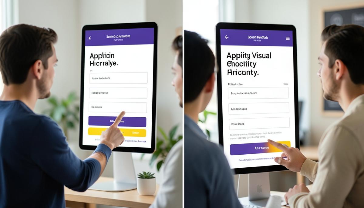
Consider a sign-up screen with a large title, two input fields, a primary Create account button, and a secondary Sign in link. The title establishes context, the fields form the task, and the filled button marks completion. The sign-in option remains available without competing with the main path. This is more effective than making the title, fields, button, and link equally bold and colorful.
Creating Rhythm with Spacing
Spacing is not leftover empty space. It defines relationships and creates a reading rhythm. Elements placed close together appear related, while larger gaps signal a change of topic or function. For example, the label and input field in a form should have a small gap because they belong together. The gap between one field group and the next should be larger. The space before the submit button may be larger again to show that it completes the entire form.
Use a limited spacing system instead of choosing every gap independently. A beginner-friendly system might include values such as 4, 8, 12, 16, 24, 32, and 48 pixels. The exact numbers are less important than consistent relationships. Small values work for tightly related items, medium values separate components, and large values divide sections. In Figma, Auto Layout makes these relationships easier to maintain because padding and gaps remain predictable when content changes.
Review spacing by comparing relationships, not isolated measurements. Ask whether the gap inside a group is clearly smaller than the gap between groups. If a card has 24 pixels of internal padding but only 8 pixels separating it from an unrelated section, the larger structure may feel compressed. Consistent spacing should make the organization visible even before the user reads the text.
Aligning Elements into a Clear Structure
Alignment creates invisible lines that make a layout feel intentional. Text, controls, images, and containers should share meaningful edges or centers. In most left-to-right interfaces, left alignment is especially useful for labels, paragraphs, lists, and form fields because the eye can return to one stable starting point. Randomly shifting elements by a few pixels creates visual noise and makes scanning slower.
A grid provides a repeatable structure for alignment. On a desktop frame, content may follow columns with consistent margins and gutters. On a mobile frame, a simpler structure with equal side margins may be enough. The grid should support the content rather than force every element to occupy the same width. A primary content area can be wider than a supporting panel while both still align to shared grid lines.
In Figma, use alignment controls, layout grids, rulers, and smart guides to inspect edges. Do not rely only on whether the composition looks approximately correct at the current zoom level. Check whether titles align with the content beneath them, whether cards share consistent boundaries, and whether controls inside repeated components begin at the same position. Accurate alignment reduces distraction and makes even a simple interface feel more trustworthy.
Grouping Related Information
Grouping helps users understand which elements belong together. Proximity is usually the first and most efficient grouping tool. A product name, price, image, and quantity control placed close together are understood as one item. A larger gap before the delivery summary separates the next topic. This approach often works without additional containers.
Borders, background fills, dividers, and cards can strengthen a group when proximity alone is insufficient. However, placing every section inside a card can make the interface fragmented. Use a container when it clarifies a meaningful unit, such as a payment method, a notification, or a repeated product result. Avoid adding borders and shadows merely to fill empty space. A clean gap may communicate structure more effectively.
Grouping must also match user tasks. On a profile form, name and contact fields may form a personal-information section, while password fields belong to security settings. Mixing these fields into one evenly spaced column hides the conceptual structure. A clearer design uses section headings and larger vertical gaps so users can scan, understand, and return to the relevant area quickly.

Evaluating and Refining the Layout
Begin evaluation by temporarily ignoring visual polish. Reduce the design to grayscale or blur your view slightly. The main title, key information, and primary action should still be distinguishable through scale, position, and spacing. If the design depends entirely on bright colors to establish order, its underlying hierarchy is weak. Grayscale review also reveals whether secondary text is too faint or whether multiple elements carry the same visual weight.
Next, trace the expected attention path. A user should move from context to essential information and then to the appropriate action without jumping between unrelated areas. For a product detail screen, this might mean product image and name first, price and options second, and Add to cart third. Supporting details should remain discoverable lower in the hierarchy. Rearrange elements when the visual order does not match the task order.
Finally, check consistency across frames. Similar headings should use the same text style, repeated components should share spacing and alignment, and primary actions should receive comparable emphasis. Use Figma styles, components, and Auto Layout to preserve these decisions as the design grows. A successful layout is not simply attractive; it makes relationships obvious, reduces search effort, and helps users act with confidence.
Lesson Checkpoint
Review what you learned and get feedback on your work.