



Introduction
Visual editing should begin with analysis, not with tools. Before changing a photograph, you need to understand what the image is trying to communicate, which visual elements already support that message, and which elements create confusion or weaken it. A strong edit is not simply more polished. It is more intentional.
This lesson introduces a practical method for breaking down a visual brief into six connected areas: subject, composition, lighting, mood, style, and technical requirements. The goal is to convert a general request such as “make this portrait feel more cinematic” into decisions that can be observed, discussed, and evaluated. The same method works for portraits, product images, editorial visuals, campaign assets, and AI-assisted image editing.
Creative direction is the bridge between the brief and the final image. It defines what should change, what should remain, and why each change matters. Without that direction, editing often becomes a sequence of attractive but unrelated adjustments.
Read the Brief as a Set of Decisions
Start by separating the brief into explicit requirements and implied expectations. An explicit requirement might specify a subject, aspect ratio, delivery platform, or reference style. An implied expectation may appear in words such as premium, intimate, energetic, natural, futuristic, or trustworthy. These words are useful, but they are not yet visual instructions. Translate each one into visible evidence.
For example, “premium” may require controlled spacing, restrained color, precise retouching, clean materials, and lighting that reveals quality. “Energetic” may require a dynamic pose, stronger diagonals, higher contrast, saturated accents, or a tighter crop. The same word can lead to different visual solutions depending on the subject and audience. Avoid treating adjectives as universal presets.
Next, identify the communication priority. Ask what the viewer must notice first, what they should understand second, and what emotional response should remain after viewing the image. If a skincare advertisement must communicate both a person and a product, the hierarchy must decide whether the face, packaging, skin texture, or brand color leads the frame. A brief becomes actionable when these priorities are ranked.

Analyze the Existing Image
Begin with the subject. Identify the primary person, object, or scene, then separate it from supporting elements. Check the subject’s pose, expression, silhouette, scale, gesture, and relationship to the background. Notice whether the subject already communicates the intended message. If not, determine whether the problem can be solved through cropping, tonal adjustment, local contrast, masking, or a more substantial image change.
Then inspect composition and visual hierarchy. Trace the main lines in the image: gaze direction, body angle, architecture, horizon, shadows, or repeated shapes. Look for the strongest area of contrast, the brightest region, and the most saturated color. These areas usually attract attention first, even when they are not the intended focal point. A bright window behind a portrait subject, for instance, may compete with the face. Reducing that distraction may be more valuable than adding detail to the subject.
Lighting should be analyzed as structure, not merely as brightness. Identify the apparent direction, size, and softness of the light source. Observe the highlight-to-shadow relationship, the shape of cast shadows, the color temperature, and the amount of ambient fill. Ask whether the lighting supports the intended mood and whether it remains physically believable. A dramatic shadow cannot be made convincing by darkening random areas; it needs a consistent relationship between light direction, form, and environment.
Mood and style should be considered separately. Mood describes the emotional atmosphere, such as calm, tense, joyful, isolated, or authoritative. Style describes the visual language used to create that atmosphere, such as documentary realism, polished commercial photography, muted editorial design, or surreal fantasy. Two images can share a quiet mood while using completely different styles. Separating these categories prevents vague direction and uncontrolled experimentation.
Turn Analysis into Creative Direction
After observing the image, write a short direction that connects the six areas. A useful direction states the subject’s role, the intended hierarchy, the lighting behavior, the emotional result, the stylistic boundary, and the delivery constraints. For example, a portrait of a craftsperson might be directed as follows: keep the hands and face as the primary anchors, use a slightly off-center composition with visible workspace context, preserve directional window light, create a focused and honest mood, use restrained documentary color, and prepare a vertical crop for mobile editorial placement.
Notice that this direction does not prescribe every editing action. It defines the desired result and the constraints that protect it. The editor can then decide whether the image needs a crop, background cleanup, color correction, selective sharpening, object removal, or a generated extension. Tool choice should follow the visual problem, not lead the creative process.
When using AI-assisted editing, describe changes in terms of visual relationships. “Make the background better” is too vague. “Reduce background contrast, preserve the original light direction, remove the bright sign near the subject’s head, and retain enough environmental detail to show location” gives the system and the reviewer a measurable target. Be especially careful with identity, anatomy, product geometry, text, and physical continuity, because these areas can change unintentionally during generative edits.
A good direction also names what must not change. Preserve the subject’s recognizable features, the product’s proportions, the key gesture, or the original architectural structure when these are essential to the brief. Negative constraints are important because an edit can become visually impressive while violating the purpose of the image.
Evaluate Before and After
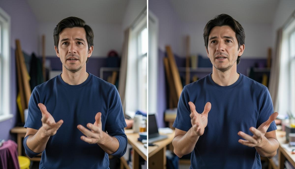
Compare the original and edited versions at three levels. First, check communication. Can a viewer identify the subject and intended message quickly? Has the focal point become clearer, or has the edit created new distractions? Second, check coherence. Do color, contrast, sharpness, perspective, and lighting appear to belong to the same image? Third, check compliance. Does the result meet the required crop, orientation, resolution, brand boundaries, and delivery context?
Use a before-and-after comparison that preserves the same viewing conditions. Review both images at thumbnail size to test hierarchy, at normal size to inspect relationships, and at a closer scale to identify technical defects. At thumbnail size, the image should still communicate its central subject. At normal size, the composition and mood should feel intentional. At closer scale, inspect halos, repeated textures, warped objects, inconsistent shadows, unnatural skin detail, and edges that reveal masking or generative artifacts.
A practical self-evaluation asks five questions. What does the viewer see first? What evidence supports the intended mood? Which element is competing with the subject? What changed that was not requested? Does the image still feel physically and stylistically consistent? These questions are more useful than asking whether the image simply looks “better,” because better is meaningless without a defined objective.
Common Failures and Final Checklist
One common failure is starting with surface effects before solving hierarchy. Stronger contrast, cinematic color, or added sharpness cannot repair a weak crop or an unclear subject. Another failure is treating references as instructions to copy. A reference should clarify qualities such as framing, palette, light, texture, or pacing, while the new image must still respond to its own subject and purpose.
Over-editing is another risk. Removing every shadow, texture, or background detail can make an image clean but lifeless. Conversely, preserving every original element can leave the intended message buried. Make each change answer a specific question: does this improve recognition, hierarchy, mood, style, or technical delivery? If it answers none of these, it may not belong in the edit.
Before final approval, confirm that the subject is clearly defined, the composition directs attention, the lighting has a believable structure, the mood matches the brief, the style is consistent, and the technical output is usable in its actual context. Then compare the result against the original and the written direction. The strongest final image is not the one with the most visible editing. It is the one in which every visible decision supports the same communication goal.
The central habit is simple: observe first, define the visual problem, establish creative constraints, edit with purpose, and evaluate against evidence. This process gives visual decisions a shared language between editor, art director, client, and reviewer. It also makes experimentation more productive because each variation can be judged by how well it serves the brief.
Lesson Checkpoint
Review what you learned and get feedback on your work.